January 24, 2020
How to use the Topcoder GUI KIT

The Topcoder GUI KIT represents a collection of buttons, textboxes, checkboxes, and other form elements as well as icons, Topcoder color palette and typography guidelines all built in Sketch format. All these elements are used when creating designs that follow the new Topcoder brand that you can see on topcoder.com.
If you browse through the Topcoder site, you will see that some of the pages still have the old style, while others are following the new style. In the next few months we plan to update all the pages to follow the new and modern Topcoder look and feel, so you can expect to see more challenges running for it.
The new TC style is modern and stylish using blobs and vivid colors. You can check out the Topcoder Brand Guideline or the defined GUI KIT.
DOWNLOAD THE GUI KIT
You might be wondering why we need a Topcoder GUI KIT. Well let me tell you some of its advantages:
It keeps consistency: as designers, it’s our duty to keep the core elements consistent when developing the different Topcoder pages. This way the programmers who are going to develop the prototypes build them in the same way all across the site, which will give a professional look for visitors.
It saves time: once you’ve planned how to solve the required UX problem on paper and you move to designing in a software tool, you don’t have to worry about creating UI elements from scratch such as buttons, textboxes, etc., or think about the overall tone, look and feel. You can just copy and paste elements from the existing GUI KIT and customize them (by changing the labels).
Boosts productivity: as you don’t have to focus so much on creating pixel perfect elements this gives you more time to create a better user experience or pay attention to other tasks.
It’s faster to update elements: because the Topcoder GUI KIT is created in Sketch based on the atomic design principle, using symbols, once you want to change the name of a button for example, you just have to type it’s label and the sizing will automatically adjust. There’s no need to worry about manually calculating the padding since this is embedded in the symbol. Same for the other elements.
If you learn to use the Topcoder GUI KIT, you will have higher chances of winning the Topcoder design challenges, as matching our existing style is definitely an important criteria when selecting the winners.
Resources You Need
The Topcoder GUI KIT is created in Sketch and you can download it from here. To be able to use it properly, you should also install the Anima plugin, which is a powerful plugin used in creation of the buttons and some of the components and also Button Relabel plugin. At Topcoder, we use a specific color palette and some predefined gradients, which you can download from Topcoder Colors and Topcoder Gradients. You can load these into Sketch using the sketch-palettes plugins.
How do you use a Topcoder GUI KIT?
A long time ago, as a beginner, I remember it was confusing to work with the GUI KIT: since it has so many elements, components and guidelines, how strictly should we follow them? If there is a pill green button defined as primary button, is it fine to use a rectangle green button as primary? Should the green color be exactly the same or it can be close? How should the typography guidelines be followed? If you have all these doubts in your mind, fear no more – this article is going to clarify all!
1. COLORS
The Topcoder palette offers a diverse range of colors to use for any type of design, from web and mobile design to logos, infographics and print materials. The color shades are made based on a core color and adding light or dark color to it.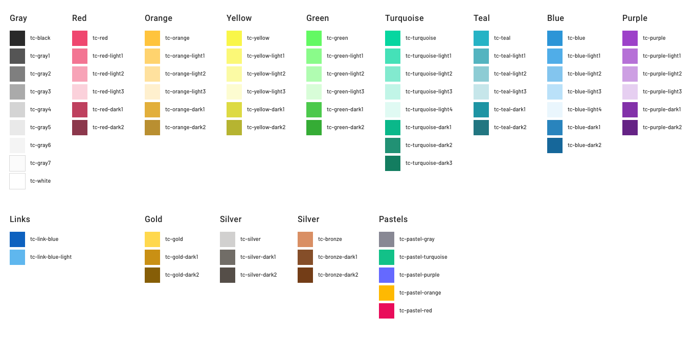
Because gray is one of the colors most used for texts and backgrounds, etc. we have a wider range of shades for it. When using the colors always stick to one of the existing colors that are predefined. This is true for text as well.
2. TYPOGRAPHY
Typography is an important part of any design layout. At Topcoder we use two font families, each with a unique purpose and use case: Barlow and Roboto. From the Barlow family we are focused on Barlow Regular and Condensed. The Barlow family is used only for headings, while Roboto is used for Subtitles, body text and captions as seen below.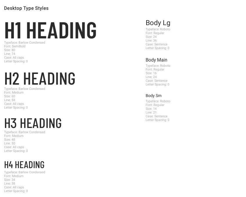
How should you approach this part? When you want to add text in your design, any text, think about if it’s a heading, a caption or a paragraph and based on that select the best size. If it’s a heading you can only use one of the existing headings from 1 to 6 and if it’s a body text, you can use only the large size (24px), main (16px) or small size (14px). No other size is allowed as it will create inconsistencies! Use what is already defined as much as possible.
When using multiple headings on a page, think about the hierarchy so you go from the first heading to the last.
Keep in mind!
✕ For headings or for regular text or captions no other font size is allowed besides those are defined in the GUI KIT
✔ When using colors for the text, always use one of the predefined gray shades or black or white as needed
3. BUTTONS

The Topcoder GUI KIT contains a few button types:
Primary button: on a white background, the full green button is the primary one. On a dark background, the white button without outline is the primary one. It should be used for the main actions we want the user to perform.
Default button: can be used instead of the primary button in a situation where we don’t want the button to stand out that much. It should also be used together with the primary button as a group of actions (example “Cancel” and “Complete” actions).
Secondary button: it has a lower visual weight than the primary button and it can be used individually or together with the other two buttons to show the different levels of action importance.
Tertiary buttons: this refers to the gray buttons in the GUI KIT, which have a lower importance than primary and secondary.
Danger button: should be used when the action is negative and you want to draw the attention of the user to the critical operation he is going to perform.
Disabled button: it is showing the disabled state of all the other buttons.
Button with icon: all the above buttons can be used with an icon as long as the padding is respected.
Note: when using default buttons on a dark background, we use the default button without the green border. This can be updated by an overwrite from the right side panel in Sketch.
The buttons exist in several sizes: large, medium, small and x-small.
If you create your design in the same document as the GUI KIT, then to add a button in your design you just have to go to menu: Insert > Document > UI KIT > Button and choose the desired size button. On the right side panel, you can overwrite the button label and the button padding will automatically resize. It’s important that the padding on all sides stays consistent, as well as the color and button shape.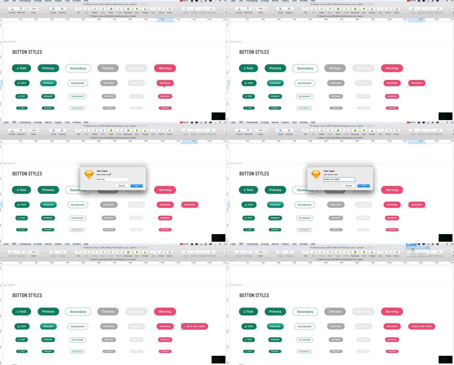
If you create your design in a different file than the GUI KIT, you need to add the GUI KIT to the Sketch libraries so you can re-use all the symbols from there or you can copy and paste from the library.
Keep in mind!
✕ Do not use any other shape for the buttons than the pill one
✕ Do not use any other color shade than those defined above
✔ Keep the height and padding consistent no matter the button text!
4. LINKS
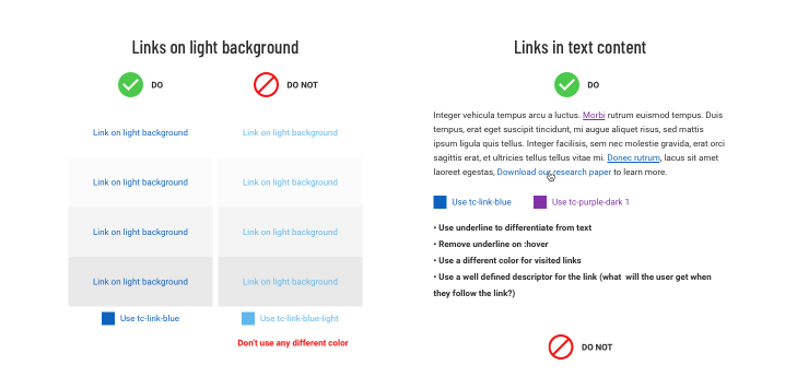
The links can be displayed in two ways depending on the context:
1. A link within a text block will always be blue
We are using two blue shades for displaying the links. If we want to show a link on a light background we will use the tc-link-blue color #0D61BF, while if we want to use the link on a dark background we use the tc-link-blue-light color #5FB7EE or white #FFFFFF. All the links should be underlined to meet our accessibility standards!
Keep in mind!
✕ Do not use different colors for links
✕ Do not leave the link without underline
✕ Do not underline content that is not a link
✕ Do not use the color of the blue links for anything but links
✕ Do not use “click here” for any link! Use the action name
2. A standalone link with arrow
Sometimes there are cases where we want to use a link as a standalone action, separate from the block of text. In this case we should always use the text in uppercase and the green color followed by a right arrow (for light background). In case we want to show the link on a dark background, the text and arrow would be white.
Keep in mind!
✕ Never use a standalone link without an arrow.
5. FORM ELEMENTS
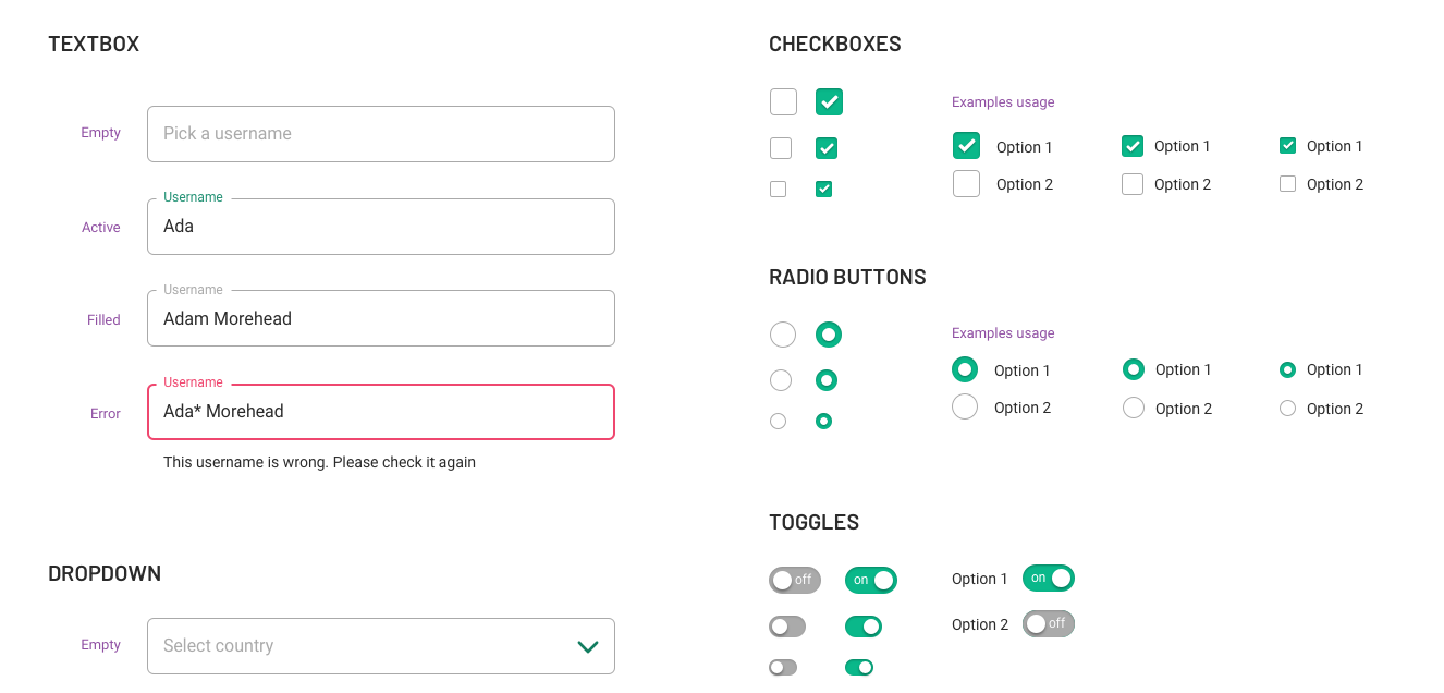
There are a couple of other form elements that are defined in the GUI KIT:
Textboxes: they can be inserted in a similar way to the buttons (Insert > Document > UI KIT > Forms and chose the textbox state you wish) and customized from the right side panel by overwriting the label and content text. The textboxes have a few states that you can see below: empty, active, filled and error.
Dropboxes have similar states to textboxes.
Radioboxes and checkboxes: come in large, medium and small sizes and can be checked or unchecked.
Toggle elements: have a large, medium and small size and they have two states: off and on.
6. ICONS
The GUI KIT also contains a set of basic icons, which consists mostly of arrows, checkmarks, etc. Feel free to reuse them in the challenges. In addition, we are using the Streamline icon set which will be provided in the challenge. To find the icon you wish, just go here and search for it. Then search by its name on your computer and add it to your design.
7. LOGO
As we move to the new Topcoder style, the Topcoder logo has progressed. We are going to use the black and white logo and in special situations the colored version from now on. This logo doesn’t use the trademark sign anymore.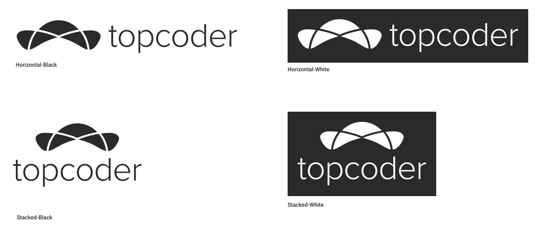
8. COMPONENTS
In addition to everything mentioned above, you can also find a couple of other components defined in the GUI KIT such as cards, collapsible panels, popups, etc.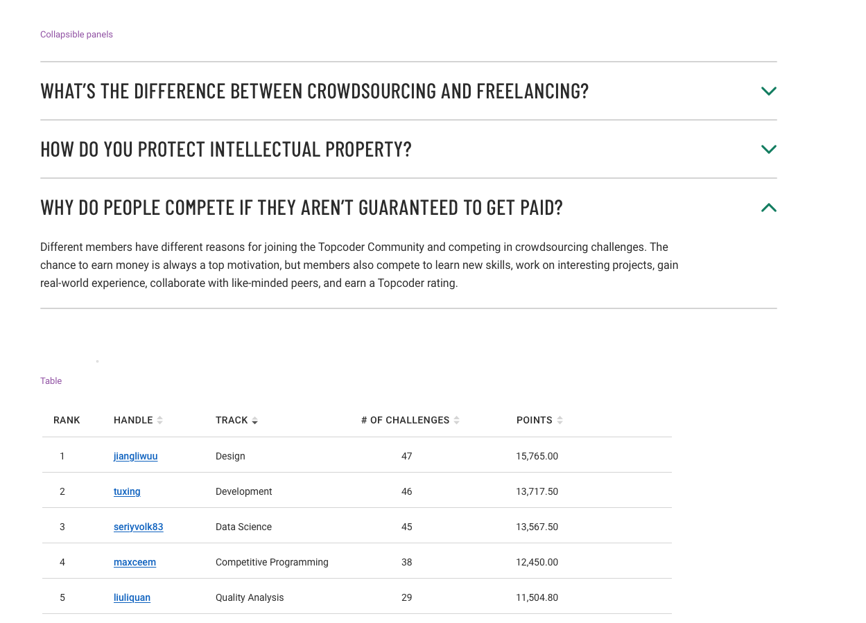
If you have any doubts or questions, reach out to us in the forums.